We are the marketing localization people. Since 1988, we’ve helped brands reach, inspire, and engage with their international customers. By partnering with our clients to understand their international growth goals, we offer a strategic blend of marketing and localization best practices to drive customer success.
A UNIQUE BLEND
SERVICES THAT MEET YOUR NEEDS
Whether you’re already established internationally or you’re testing the waters in a new market, we’ll help you develop the right content, tools, and tactics to reach (and convert) your target customer around the world. For the short-term and the long-haul.
With our unique blend of marketing and localization capabilities, we offer a variety of services to help you succeed internationally.
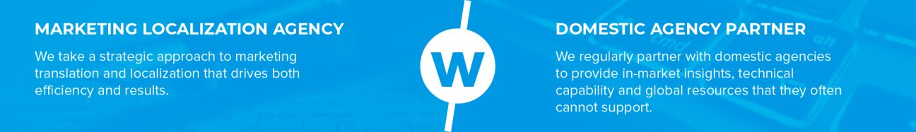
With the only operating model and global resource network in our industry designed specifically for marketing and creative content, we have the talent and experience you need.
Our full-production operations in London and Denver, our delivery hubs in Xi’an and Tokyo, and our staff located across the US, UK, Belgium, New Zealand, Tokyo, the Philippines, and Mexico all work together to deliver the Wordbank difference.
Our in-house staff lead dedicated in-country linguistic and marketing teams that are fully onboarded to your brand + marketing goals and are connected with your local stakeholders wherever needed.
95+ COUNTRIES 4,000+ MULTILINGUAL RESOURCES 140+ LANGUAGES
LINGUISTS • COPYWRITERS • DIGITAL MARKETERS • DESIGNERS • RESEARCHERS
challenging the status quo
THE WORDBANK DIFFERENCE
We strive to be remarkable in all that we do. Our vision is to own and define the true meaning and value of marketing localization – and to help clients achieve the right balance of people, process, and systems needed to deliver lasting growth and ROI. Three simple things set us apart in our industry:
“I used their services extensively at Nike and am still promoting them and getting great feedback from everybody I connect them with. They do more than mere 'localization' at Wordbank. Their services are really as simple or as complex as required but always flawless in execution and in fidelity to the text and spirit of what one wants to achieve.”
User Experience Director
“Wordbank has been an absolute pleasure to work with. No problem too big or small, they endeavor to be as flexible as possible while delivering the most efficient and professional service as possible at an agreeable cost. I would most definitely use Wordbank again in the future.”
Associate Project Manager
“You are definitely proving your value above and beyond a linguistics expertise to show that you understand what marketing and SEM professionals need in a B2B setting. That is a unique proposition that we have not found in any other provider, and it certainly helps to build credibility with our European colleagues who are skeptical of an American-based company understanding their cultural uniqueness.”
Marketing Manager
“Wordbank is a reliable partner that perfectly understands the needs of their customers. They are quick to respond and deliver high-quality results as well as being friendly, professional, and always a pleasure to collaborate with.”
Account Manager
“Working with Wordbank is an absolute pleasure. The advice and work produced by the team has really provided us with the opportunity to strengthen our written communications across several countries. They have made handling several different projects at the same time look easy, each delivered on time and in line with our requirements. It's great to know that they are always a phone call or email away, and we really look forward to continuing to work with them.”
European Marketing Program Executive
“We looked at a few transcreation agencies before partnering with Wordbank, and it was obvious that Wordbank’s approach to bringing to life the core character of our brand was unique. They understood immediately the importance of our personality and tone of voice, and the results have been brilliant across multiple streams of work.”
Head of International Business Development
“I consider Wordbank to be a part of our team – truly a partner, not a vendor. This partnership allowed us to expand [our program] from 6 languages to 25, develop a process to engage in-country [consultants] as well as their expert linguists, and quickly respond to client requests and feedback ... The result has been a sustainable and repeatable process integrated into our overall development approach, allowing us to deliver what our clients need.”
Consultant/Project Manager
“It's definitely the best localization company I have ever worked for. I find the knowledge, experience, and professional touch of Wordbank's PMs is unsurpassed.”
Italian Linguist
“I like working with Wordbank because I feel I am treated as a human being and not as a commodity (no unreasonable work time/deadlines like with some other agencies).”
Italian Linguist
“Every single member of Wordbank team stands out for politeness, support, professionalism, and collaboration. They are all a pleasure to work with and are always keen to help me and really know what is involved in a freelancer's job. They are always ready to sort problems, to offer help and guidelines. Really I could not wish for more.”